An Evolving Brand: History of Changes to the Würth Logo
11/02/22
Learn how the Würth logo was refined over time

Würth is a company famed for its innovation. All of its products undergo a meticulous design process to maximise the potential of their design, and have won awards for innovative design. At the core of Würth’s business and identity is its infallible fasteners.

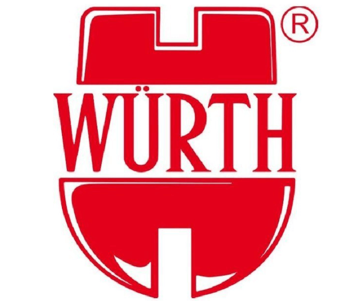
The genius of the Würth logo is that, in essence, it is like a crest. It includes the letter W, the family name, while also incorporating its signature products: a cheese head screw and an inverted round head screw are brought together to create a new, recognisable symbol, emblematic of this world-renowned family business.

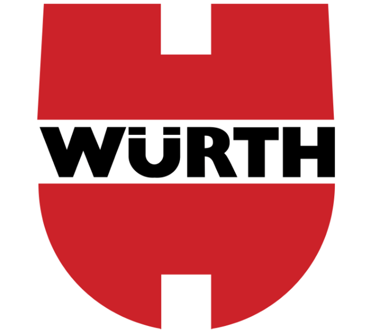
As time moved on from the mid-twentieth century, so too did the design aesthetics of the Würth Group’s logo. By the 1970s, new design and printing techniques resulted in a more symmetrical logo, and the refined logo was adopted for all print and promotions.
Around this time, Würth began its sponsorship of motorsports, and its logo quickly became visible in the racing community.

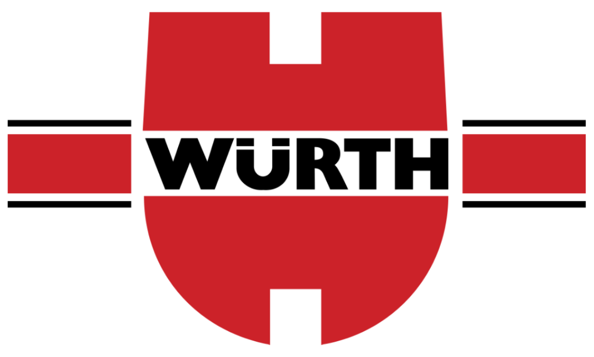
In 1983 the company modified the logo by adding a brand strip. By this time Würth was a significant patron to professional motorsports as well as snow sports.

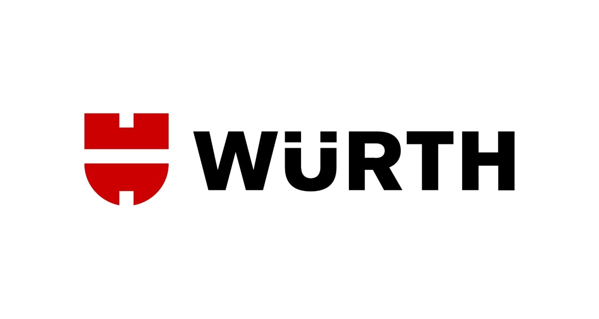
In 2010, the 65th anniversary of Würth, the logo was revamped again. The name ‘Würth’ was extricated from the middle of the symbol to stand on its own and balance the brand image.
Today, the name and the logo are equally well-known around the world, and both are synonymous with innovative, high-quality tools and products for all trade professionals.
